Chrysler
Mobile Web Platform & System Design
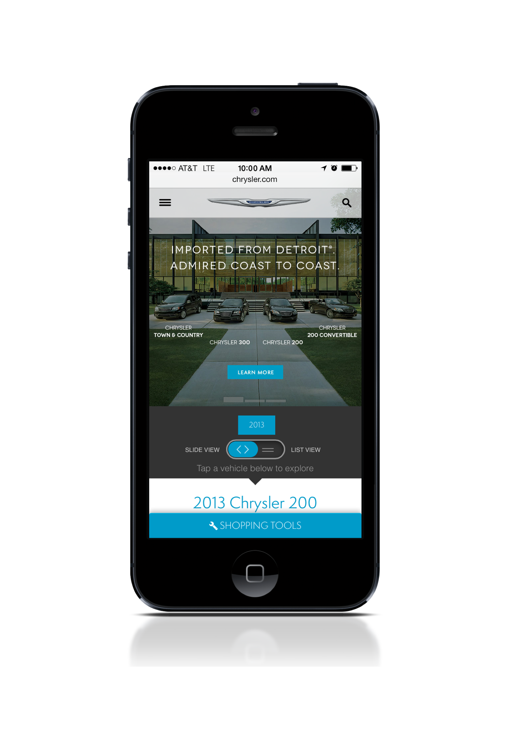
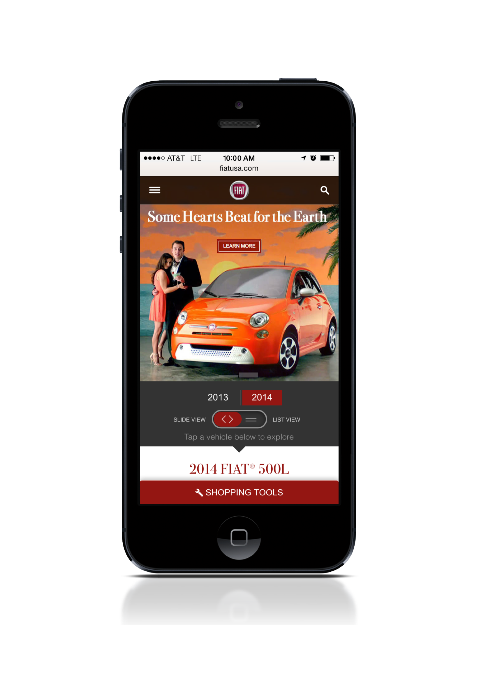
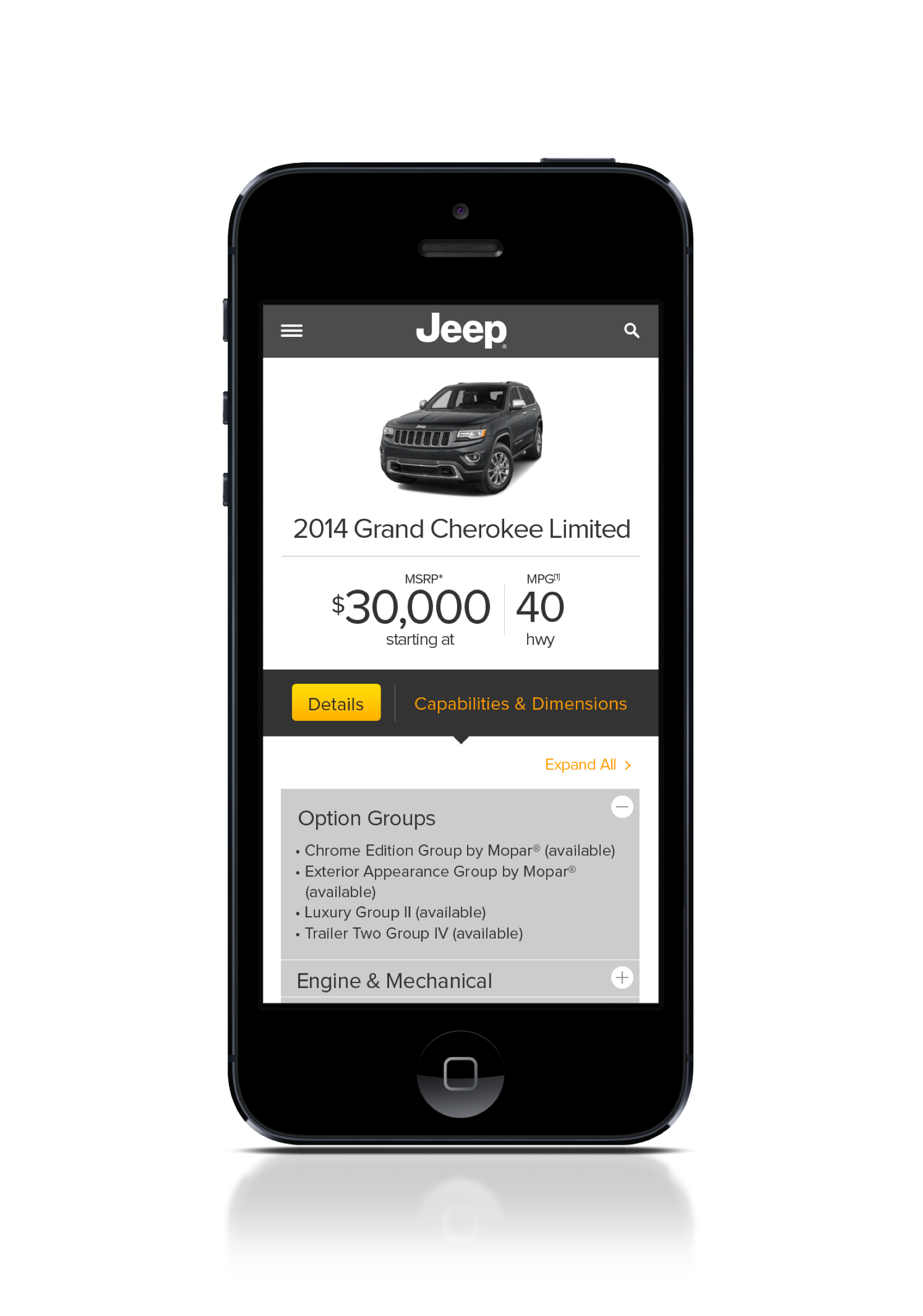
The Chrysler mobile v3 redesign is a complete reimagining and redesign of the mobile web platform and design system delivering all five (Jeep, Ram, Dodge, Fiat and Chrysler) Chrysler brand mobile experiences.
ROLE
Sr. Art Director – Led the strategic direction for mobile v3 redesign. Includes stakeholder alignment, client presentation, concepting, pitching, testing and final delivery.
TEAM
04 – User Experience Designers
03 – Project Manager
01 – Front-End Developer
Sr. Art Director – Led the strategic direction for mobile v3 redesign. Includes stakeholder alignment, client presentation, concepting, pitching, testing and final delivery.
TEAM
04 – User Experience Designers
03 – Project Manager
01 – Front-End Developer

The v2 family of Chrysler mobile sites were built long prior to their desktop counterparts and thus were extremely limited experientially. Unlike their desktop counterparts, the v3 mobile redesign was considered as a single project inclusive of all brands. This meant building a design system that all five SapientNitro desktop teams could easily interpret their experiences within.
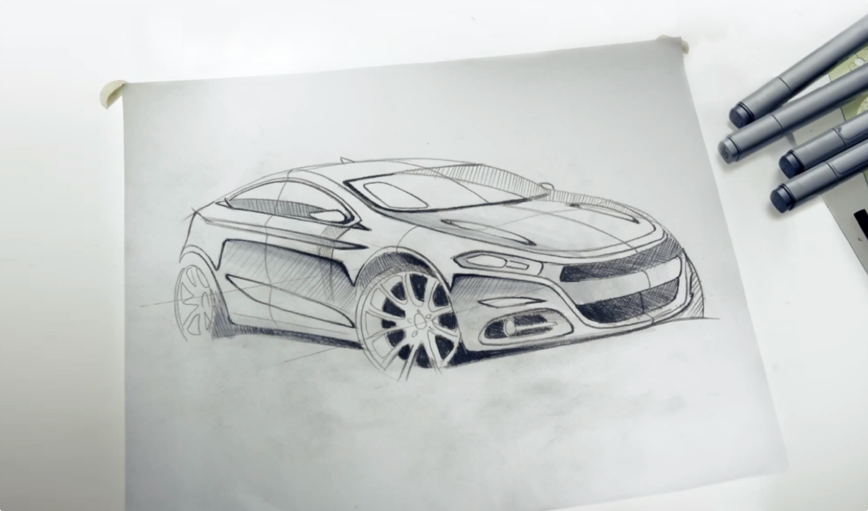
The limitations of the previous system were so extensive that it was immediately clear a completely new system was necessary. With that in mind we began with sketching and exploring what a new experience vision might consist of. As we completed our first round of concepts and began sharing them internally a few challenges arose.
Internal & external approval
—
Each desktop brand experience was owned by a different Sapient office. With five separate teams creating unique experiences for their brand, that essentially meant we had five internal stakeholders to sell on the v3 redesign in addition to our Chrysler stakeholders.
—
Each desktop brand experience was owned by a different Sapient office. With five separate teams creating unique experiences for their brand, that essentially meant we had five internal stakeholders to sell on the v3 redesign in addition to our Chrysler stakeholders.
Avoiding content distractions
—
Model year updates are a particularly hectic time of year for automotive accounts. Chasing all the details and making sure everything is correct is a monumental undertaking. Considering this when designing a mobile system for these experiences, getting distracted by content was a massive hurdle to clear.
Building a family
—
Due to each brand’s desktop experience being designed by separate teams, there were distinct differences between them. Seamlessly unifying all brands on the mobile v3 platform would require careful consideration and a thoughtful system.
—
Due to each brand’s desktop experience being designed by separate teams, there were distinct differences between them. Seamlessly unifying all brands on the mobile v3 platform would require careful consideration and a thoughtful system.

From the onset we faced an uphill battle keeping our internal teams focused on the capability of the system itself rather than accuracy of the content within. To effectively keep our teams focused I chose to abstract the brand initially.
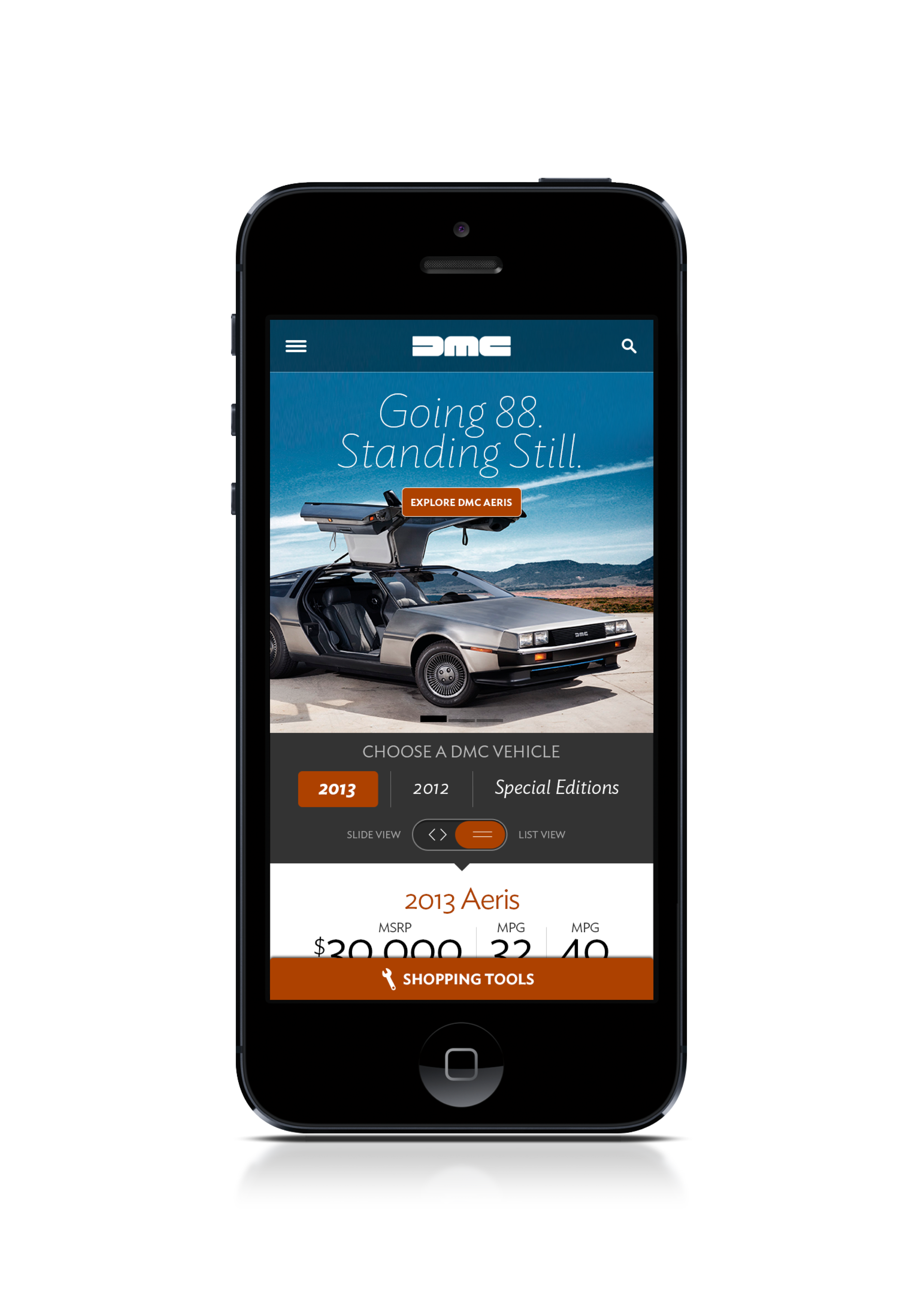
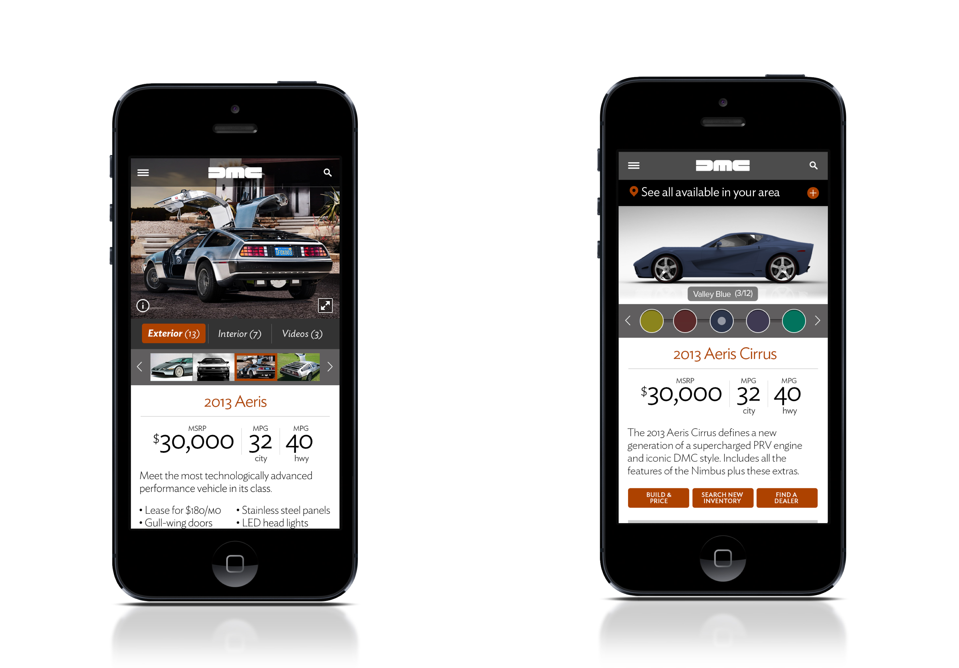
In light of that we leveraged a familiar yet unassociated brand – Delorean – and assets which would stand in for our own. This proved to be quite successful as we soon got buy-in internally and externally without any content hang-ups.
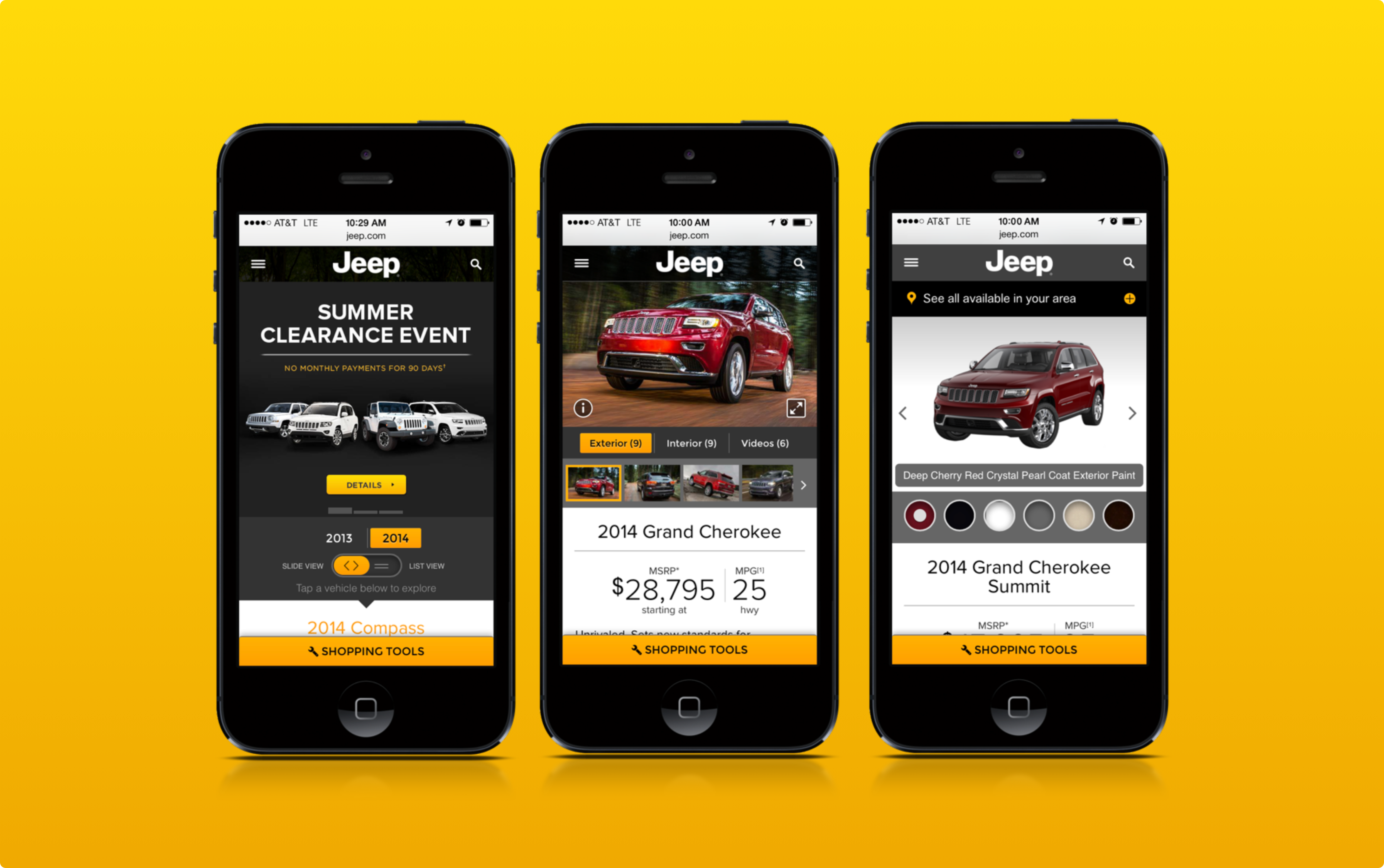


We successfully designed the new platform and design system, achieving internal and external sign off along the way. The next hurdle to clear was ensuring it was used properly and consistently.