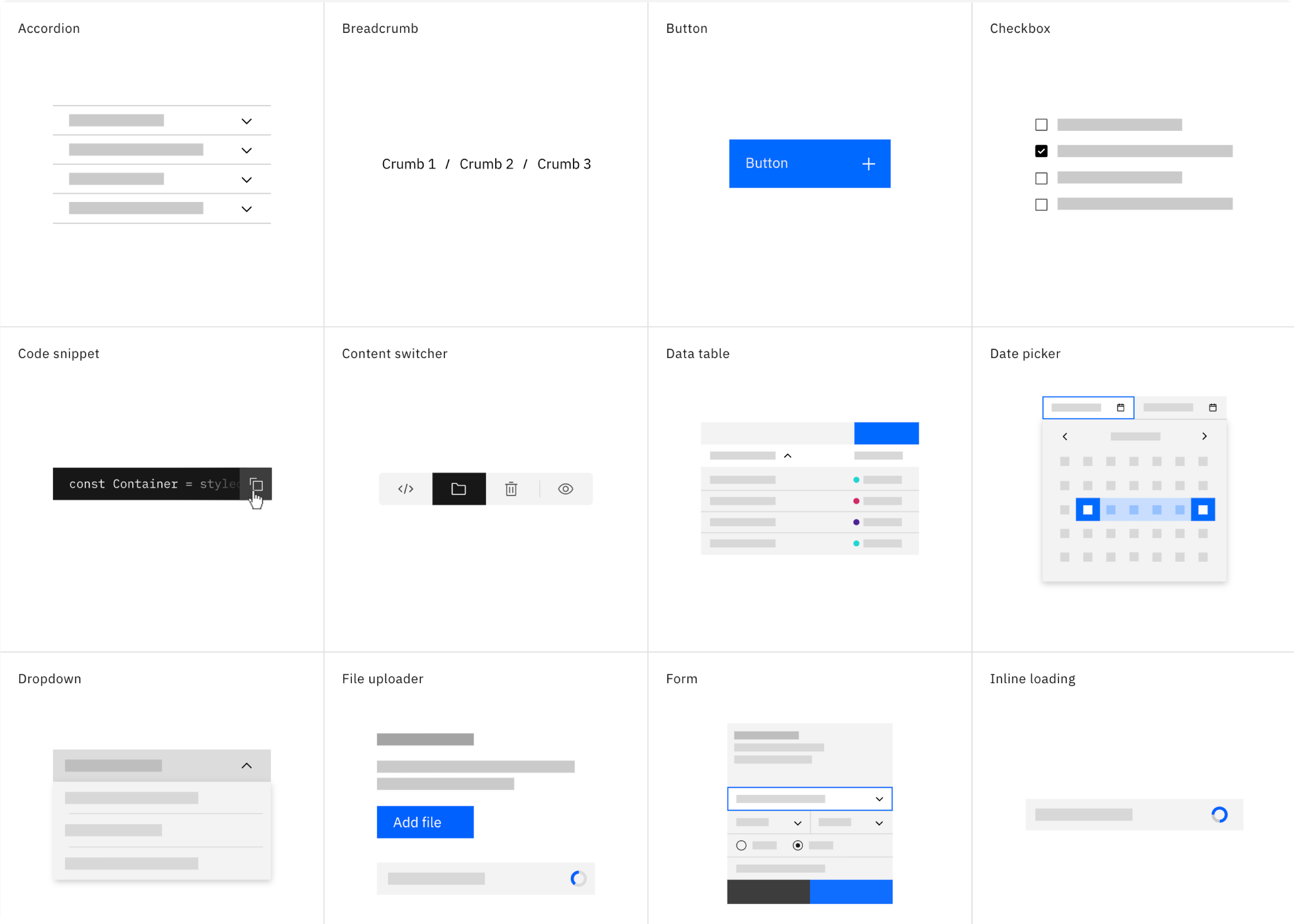
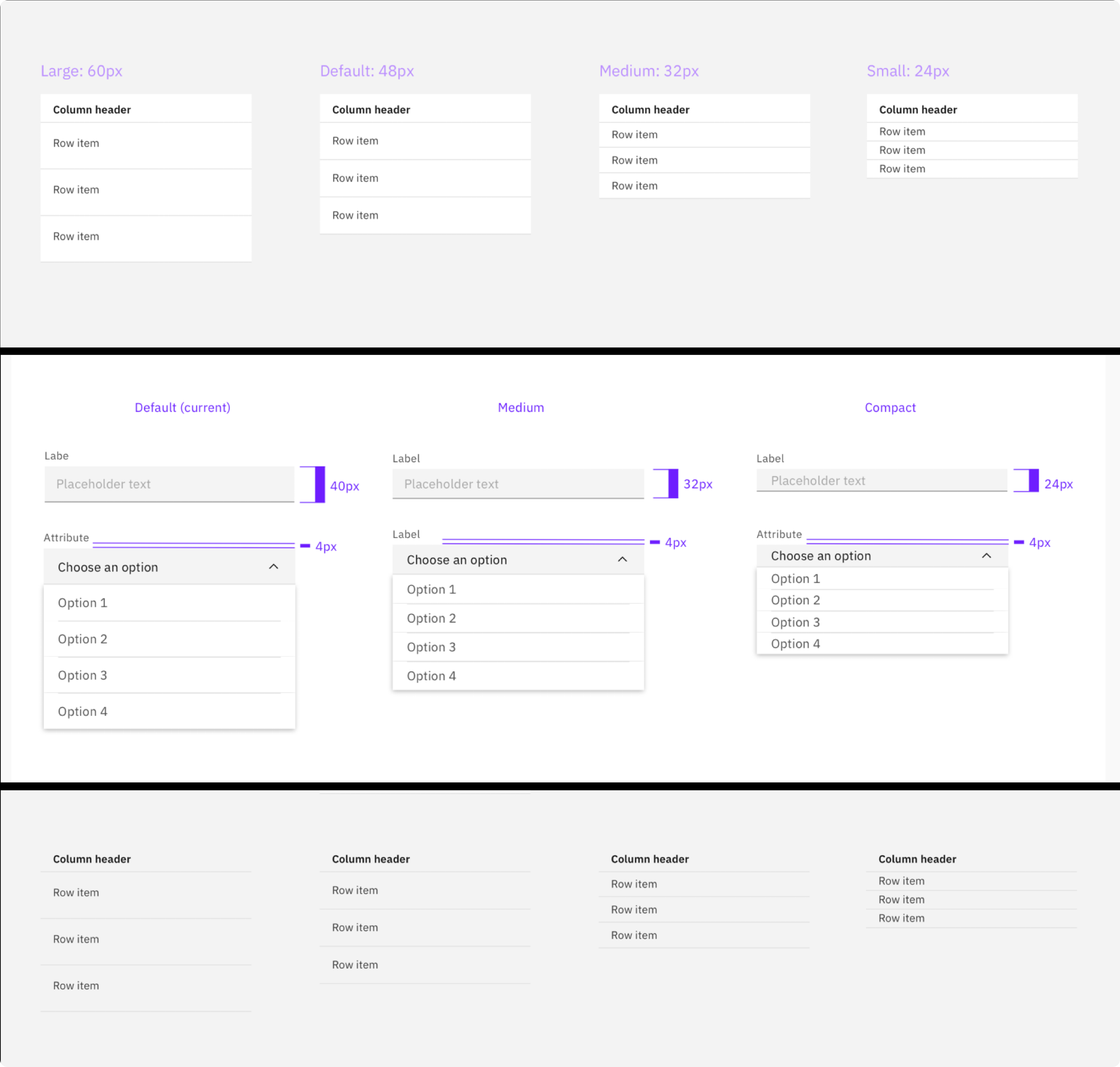
One of the biggest challenges we faced in updating Safer Payments was that the Carbon elements themselves and spacing built into the system were all too big. Case investigators need to optimize every bit of screen real estate available, thus the feedback was the new UI wasted too much space.
Amending elements was a deviation from the guidance in Carbon itself, however we worked closely with the Carbon team to design smaller elements that would still be compliant.
What resulted was a suite of elements that suited our user’s needs perfectly and were also adopted by Carbon for other IBM teams to use.

