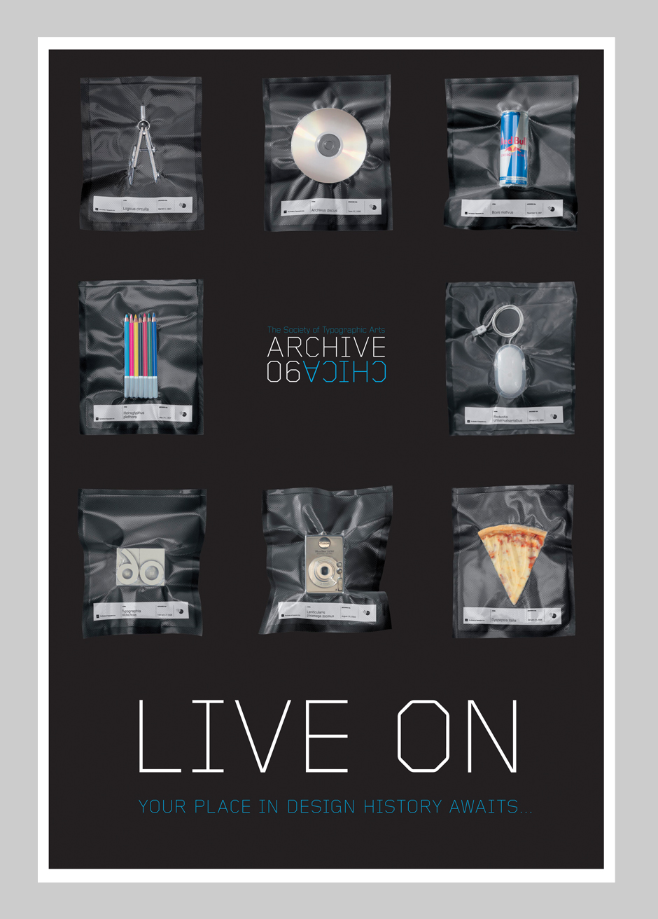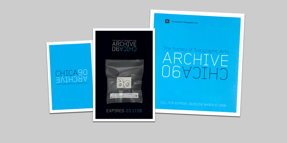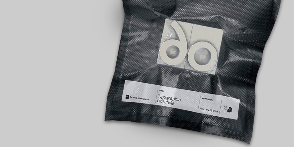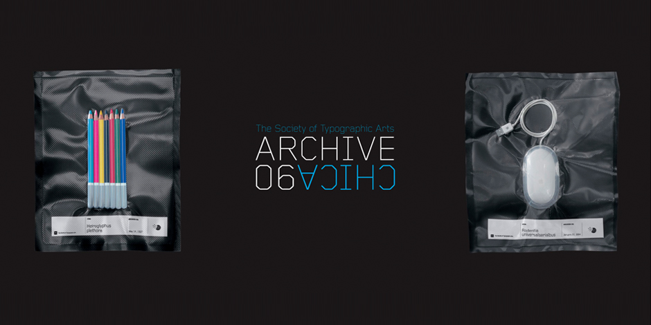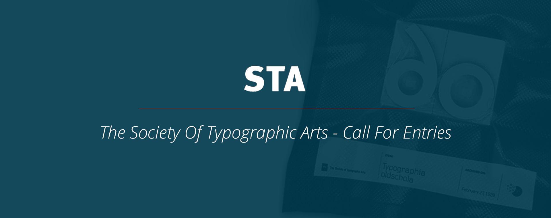
The STA is a Chicago based organization whose call for entries is restricted to local designers. The client wanted a clean, fresh and impactful series, with a focus on appealing to a younger design audience. The resulting work pushed the concept of preservation as it relates to designers forever “living on” in the STA’s online archives. The project was met with great enthusiasm and approval not only from the client but from STA members and applicants as well. The series also earned features in Print, How and GD USA (not to mention a spot in the archive it was designed to promote).
This was among my first professionally awarded work and one of my favorite print designs projects. I contributed to the concept development (played several clever pranks with vacuum-sealed items), designed the logo, got my feet wet in copywriting and saw it through to the press check.